Visualising the basis for ‘balancing’ production and environment
Below we use outputs from the HPM to consider at a glance how numerous management options alter the balance between ‘production’ vs its environmental impacts, and to propose just what kinds of actions/policies are available to achieve whatever balance, or ‘trade-off’, between production and environment society might choose.
Rather than draw conventional ‘response’ graphs, we draw a ‘map’ . The ‘map’ has the two seemingly opposing goals, food vs environment, one on each axis. Both are ‘outputs’ (and so emergent properties) of the model. In looking at these ‘maps’, it is not necessary for us to judge or pre-determine what society should/would choose. We simply use the knowledge of how the biological system functions to suggest what are the prospects for sustainable options, and how to deliver them.
This equates to taking the best of our current knowledge (collated by many, and over decades) on how the biophysical system ‘works’, and setting this in a context which encapsulates perceived challenges/conflicts in society. This allows us to consider, objectively, different options for resolving conflicting options, or at least for seeking the optimal ‘balance’ or ‘trade-offs’. This can be used to advise policy. This approaches is more in keeping with behavioural ecology and consumer economics (refs).
What we mean by a ‘map’ and how this differs from a ‘normal’ graph
Normally a measure of interest (eg methane production) would be drawn as an ‘output‘ on the dependent (y) axis, to consider how this emission responds to some ‘input‘ (eg fertiliser N), drawn along an ‘independent’ (x) axis. ‘Response graphs’ of that form can be seen in the corresponding sections (eg ‘irrigation’; and ‘supplements’). But that form of presentation makes it harder to visualise how each and every combination of actions would affect the potential ‘trade-off’ between two important ‘outputs’ of concern (food and environment) simultaneously. With a ‘map’ we can simply see how different choices ‘move us around’ in the space between the two axes, and so alter the balance of two outcomes ‘production’ and ‘environment’.
How management options alter the trade-off between ‘production’ and ‘environment’
In the graphs below, we plot some outputs from the HPM, for a wide range of combinations of managements, inside map axes as described above.
The examples consider combinations of animal class (meat or dairy), nitrogen fertiliser inputs, and irrigation (at critical times in summer). For an equivalent set of graphs, to consider supplement inputs, see ‘supplements’.
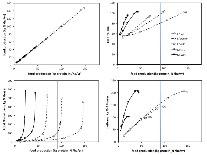
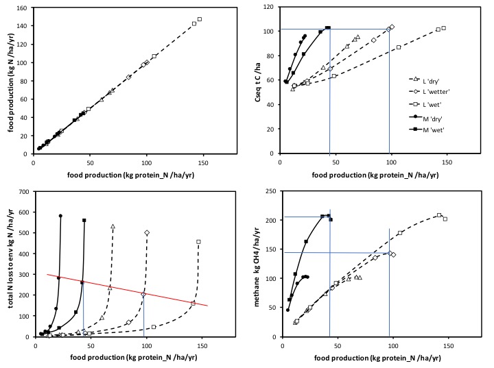
The first thing to note is that different management combinations have different (sometimes opposing) effects on the three main impacts shown (namely the amount of C sequestered (b); the annual rate of total-N release to the environment (c); and the annual rate of methane emissions (d). Hence we must draw out a separate graph (of the same form) for each main environmental indicator. Also note that, to retain arithmetical, linear axes, we must draw the C sequestration axis in a way that ‘up’ is good (less adverse impact): ‘down’ is bad.
The top left-hand graph (a) is trivial (plotting something against itself) but is plotted here to retain the same layout as used for the ‘response’ graphs (eg see ‘irrigation’ , ‘supplements’) , and so we can switch readily between ‘response graphs’ and ‘trade-off’ maps, if this aids understanding.

Mapped within these axes are the outputs of the HPM (all expressed per hectare), in which the solid lines and symbols depict ‘meat’ systems (cattle or sheep in general), and the dashed lines, and open symbols, depict ‘dairy’ systems (which could equally be either cattle or sheep lactation based). The points (symbols) along each line are the solutions for each of a range of fertiliser N input rates (of 15, 30, 60, 150, 300, and 600 kgN/ha/year). Note, adding fertiliser moves us ‘up’ and ‘to the right’ on all graphs. The different forms of symbols, as shown in the key, depict the effects of irrigation, where ‘dry’ is no irrigation; ‘wet’ is irrigation to achieve a 50% increase in water input (relative to rainfall) in 3 ‘dry’ (insufficient rainfall) months in summer; and ‘wetter’ a 100% increase in water input in those three critical months. All outputs are for the same site, modelled on Winchmore, in S Island, NZ. All are the long-term sustainable rates and states predicted by the model, noting that outcomes in the shorter term, including then those even from direct experiments/empirical measurements, can reflect temporary transients, some which run counter to what the final outcome will be after the whole system has re-adjusted (see publications). All are based on stocking rate being optimally matched to the rate of supply of fresh forage, in all cases (see ‘Methods’ in ‘clarifications’), overcoming the scatter and distraction of simple mis-management of pasture.
In the first set of four figures above, we can see first and foremost how the use of dairy (lactating) animals (see dotted lines) very favourably improves the balance of food production in relation to its environmental impacts, compared to using ‘meat’ animals (all the dotted lines are shifted to the right compared to the solid lines). Hence, for any chosen level of N fertiliser input rate, a dairy system allows far greater food production, for a similar, in some cases far lower, level of an adverse environmental impact (total N releases, or methane production per ha per year), than does the use of a ‘meat’ system. Using ‘dairy’ animals offers the option of far greater sustained rates of food production, without necessarily prejudicing the total amount of carbon sequestered (see Figure b). These major improvements in the balance of food production vs environmental impacts (notably the effects on total N releases) are a consequence of the major difference in the partitioning and so fate of ‘N’ in lactating (vs dry) animals, and its longer-term consequences on the amount of N cycling in the system (see ‘dairy’ v ‘meat’), and its effectiveness in C capture.
For the corresponding ’emissions intensity’ graphs, and ‘nitrogen use efficiency graph, see ‘irrigation’.
Secondly, it is clear from these figures how irrigation at critical times (here three months in mid-summer) also can favourably improve the balance between food production and its environmental impacts (the ‘wet’ and ‘wetter’ lines are shifted again to the right and so up along the sustained food production axis). This is explained in how the use of water at these times overcomes the physiological restriction to carbon capture (photosynthesis) that low leaf water potential imposes (refer to link). By enabling greater (less restricted) carbon capture per ha, more plant growth takes place, more food production can be sustained, more C can sustainably be sequestered. Notably, the vegetation dynamically becomes less carbon limited, and so the uptake of N is increased, of which more per ha per annum is harvested.. all leading to a reduction (at any one N input rate) in the rate of release of N to the environment (see ‘irrigation’). This is an example of how ‘irrigation’ can be held to be ‘good for the environment’, though the ‘argument’ must be defined very precisely.
Note however that irrigation, by having increased carbon capture, and so greater vegetation growth rates, can lead to greater methane emissions. This is simply because more animals could be sustained per ha, but note how the lines depicting the effects of adding water in summer, (for any one class of animal type) overlap… the higher rates of water input ‘extending’ the relationship between ‘food production’ and this ‘adverse environmental impact’ (in contrast to the separate lines seen for eg total N releases, or C sequestration). These different patterns of interaction present a challenge for society when choosing an optimum balance, and so setting a policy (see below).
The effects of fertiliser N input rates, for all examples, can be seen from following the sequence of symbols along each, any line. Comparisons between the different cases eg ‘dairy’ vs ‘meat’, and/or water deficient (‘dry’) vs summer irrigated (‘wetter’), can be made either at the same, or at different, eg higher, rates of N input on ‘dairy’ compared to ‘meat’. One can freely choose to compare values at whatever N input rate is wished (eg ‘dairy’,’irrigated’ at ‘300 N input’; could be compared freely with ‘meat’, ‘dry’, at ’60 N input’). All options are available. But in general, increasing N inputs increases the capture of C, when the system would otherwise have been N limited, but only up to a point where the system becomes, instead, C limited, (photosynthesis is not increased above a given leaf N concentration in these grassland plant species) as described in [section N input link here to be added]. Hence, note, in the context of this presentation, for those ‘impacts’ that are carbon focussed (eg the amount of carbon sequestered; or rates of methane production) the symbols for N input rates become compressed (closer together) where the system has become C limited (eg see Figure b and d at high N input rates). By contrast the corresponding values for total N releases ‘stretch apart’ (see Figure c), as N inputs exceed the capacity of the plants (and so system) to retain N in organic matter.
[Note: to view a comparable set of ‘maps’, but which consider the use of supplements, see ‘supplements’ ]
Visualising the outcome of different options for society and policy
We explore five possible policy options:
i) Setting a desired level on food production.
ii) Setting a limit on the level of N release/impact.
iii) Setting a limit (cap) on inputs (eg of N)
iv) Setting targets to limit methane emissions
v) Policy arguments focussed on ’emissions intensity’ or ‘N use efficiency’
The outcomes for these possible choices by society can be read ‘graphically’ .. that is from lines extrapolated from the axes on the graphs.
i) Society chooses a given level of food production
The most notable feature, from mapping examples in this way, is that rather than a single line (as depicted earlier above) there are simply multiple lines. This means there are many different ways, there are options, for society in how to alter the balance between food production and its environmental consequences.
We can consider for example what would be the implications if society chose a given desired level of food production. This can be considered by drawing a vertical line (in this case at an arbitrary value at a reasonably high rate of food production) on the x axis, and then reading off (on the y-axis) what the implications (consequences) would be for environmental impacts (all of them). Where more than one line is crossed (by the vertical line)…that means there are options. Only one (of two) options is projected across to the y-axis in the graphs below.
In the first instance (above) we have chosen (arbtrarily) a relatively high level of sustainable food production per ha per year.
This (one) example reveals that the desired level of food production (per ha per year) as depicted by the vertical line, could only be sustained using ‘dairy’ animals, there is no case, at any level of N input rate, nor irrigation, that would achieve that level of food production per ha per annum, using ‘meat’ animals. Using dairy animals, note, the same level of food production could be achieved with partially irrigated pasture at a relatively high rate of N inputs per ha per year (the example drawn in by the blue vertical lines), or by well irrigated pastureland using a lower rate of N inputs per ha (the vertical line crosses two lines on the map). The effects of these two options can be compared. Using lower N inputs on a more irrigated pasture would lead to far lower total N releases (see on Figure c), slightly raise methane emissions (Figure d), but substantially reduce the amount of C that could sustainably be sequestered (Figure b).
If in a second instance (below) society were to choose/accept a lower level of sustainable food production (see the blue vertical line shifted to the left in the graphs below), it then becomes clear that the same level of food production could now be obtained either with ‘meat’ animals, or ‘dairy’ animals, but note how choosing ‘meat’ animals would lead to higher rates of total N release to the environment (even if associated with lower N input rates) than if the same level of low food production were delivered using ‘dairy’ animals. Choosing ‘meat’ systems (in place of ‘dairy” would also lead to far greater methane emissions (for the same food production rate), and hence far greater emissions per unit food produced. But choosing meat would lead to greater levels of C sequestered per ha.. albeit this benefit is only available if low levels of food production per ha per year are chosen. ‘Dairy’, as above, can deliver far greater food production rates, without necessarily leading to a lower level of sustained C sequestration.
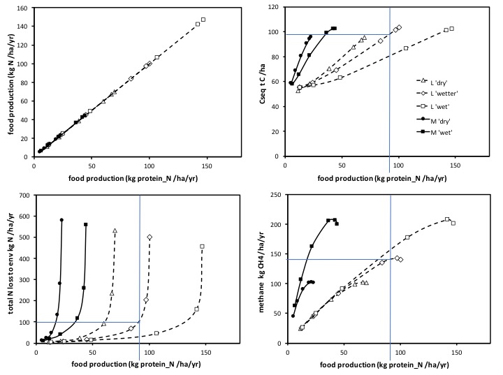
ii) Setting a limit on N release/emission
Alternatively, society could choose to put an upper limit on say one particular impact, eg a maximum level of total N release per ha per year, which can be envisaged as a horizontal line on the bottom left graph as below…
.. this is a little more complicated, but the consequences can be seen by starting on that bottom left graph (see green arrow) extending a horizontal line that depicts a limit on total N releases. Doing so we note that more than one graph line is crossed (this time five are crossed by the horizontal line) so there are multiple options. For each intersection (just one example is enlarged on here), we can project a line this time down to the x-axis, and read off the consequences of the proposed policy for food production. We can then move across to all the other graphs, and project upwards (vertically) from their own x-axis, at that same food production level (see green arrows on x-axes), and read off their y-axes, just what the consequences would be for those other environmental measures, of the policy in question. Note again there are five options that could be considered in the example shown, and each can be evaluated as above.
One key feature to consider here is that setting an upper limit on say the total release of N to the environment does not in itself necessarily restrict food production, and, surprisingly, to many perhaps, food production per ha per year could be sustained at a relatively high rate, but notably only by using ‘dairy’ animals, compared to ‘meat’ animals. Provided ‘dairy’ animals are used, the limit placed on total N releases (this policy) can be met, even though to do so would require a higher rate of N inputs per ha per year. Moreso, high rates of food production can be sustained, still within this N release limit policy, by using summer irrigation. Note, again, that doing so would actually require a higher sustained rate of N fertiliser inputs (see ‘irrigation’). These would be essential to replace the nutrients (N) removed as milk, and so sustain C and N cycling in the system.
If society rejected a pastoral industry based on ‘dairy’ animals, on the presumption this would be a sure route to reduce environmental impacts (notably N related ones), this would serve only, under this cap on N releases policy, to unnecessarily reduce food production.
By mapping a different option, eg where the horizontal policy line crosses either of the lines depicting a ‘meat’ based system (the solid line with solid round symbols for unirrigated, or solid square symbols for fully irrigated ‘meat’), we can consider how choosing meat systems would differ from choosing dairy systems, under this policy.
Placing an upper limit on the total releases of N to the environment does not in itself ensure the best overall outcome. If meat systems were used, this would lead to not only substantially lower food production per ha, but also to far greater methane emissions (than would have ‘dairy’). It would however offer the capacity to sustain far greater total sequestered carbon. Putting a limit on the total release on N to the environment does not in any simple way satisfy all requirements (or intentions) of society.
iii) setting a ‘cap’ on N inputs
Society could consider imposing eg a limit on a given fertiliser N input, say arbitrarily of 300 kgN/ha/yr. This too can be considered, in this case by drawing a line which joins up all the data points that represent an input of this amount of fertiliser (hence the sloping line drawn onto eg the bottom left figure below)..
..as before, projecting down to the x-axis any cases where this sloping line crosses one of the model solutions (there will be as many options as there are solution lines, but we have drawn in just two of the five examples), informs us what would be the consequences. Again, these can be explored by projecting vertical lines down towards the bottom, x axis. Then transferring those values for food production (where the vertical lines cut the bottom axis) across to the other graphs, as before, and projecting upwards, and across, to their respective y-axes. Using the just two examples drawn in, the consequences of such a nitrogen use cap (eg) on the other measures of environmental impact (here methane and C sequestration) are evident.
Capping N inputs need not preclude sustainable reasonable levels of food production, though to sustain high rates of food production, it would be necessary, again, to use ‘dairy’ animals in preference to ‘meat’ animals. And again better results are obtained with ‘dairy’ with some summer irrigation (Figure c). Looking at other consequences, placing a cap on N inputs does not itself preclude there being a major increase in methane emissions, as this would arise if the cap drove farmers to use ‘meat’ animals, in place of ‘dairy’ (see Figure d). Fortunately, the cap on N inputs might have little impact on the amount of C sequestered (Figure b).
In short, again, choosing one seemingly straightforward policy, in this case a cap on inputs, would not itself preclude multiple options for farmers that would lead to very contrasting combinations of benefits (food production and C sequestration) and adverse impacts (methane emissions and total N release). Hence the policy would have uncertain outcomes in practice.
iv) Setting targets to limit methane emissions
The same (graphical) approach can be used to consider the implications of efforts to limit methane emissions. This is of paramount importance for NZ to meet obligations under the Paris Accord. The analysis below focusses on the collateral impacts of different bases for limiting methane emissions on the biophysical system. We do not consider here the financial implications, (though those could also be mapped into this scheme).
Looking at the same visualisations of the system, but focussing more on methane emissions (Figure d) we can consider the effect of any one proposed limit to methane production per ha (by drawing a horizontal line, at some chosen level, across Figure d) and considering what are the consequences of not just choosing, but lowering, that horizontal line, on Figure d).
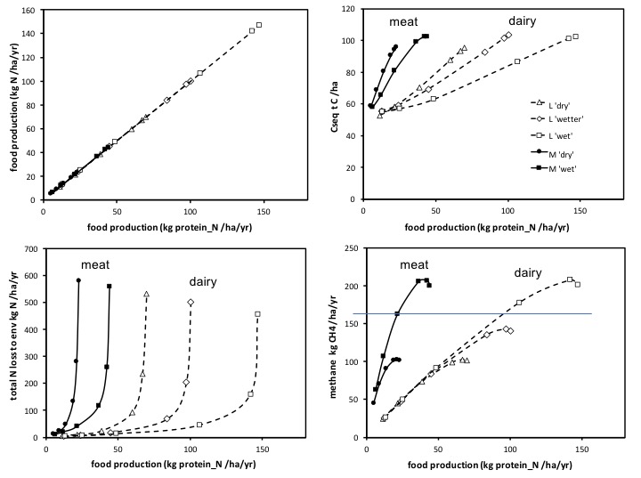
First it is clear that for any given chosen rate of methane emissions per ha per year, the rate of food production per ha per year would be very substantially lower, if production was based on a ‘meat’ system, than on a ‘dairy’ system. Hence it would be very inappropriate to presume that methane emissions per ha per year would be reduced by reducing ‘dairy’ ha, if the same area were substituted for ha of a ‘meat’ system.
Second, it is clear that in the case of methane emissions, within either one animal type, the relationship between food production and methane emission comes close to being a single line, and hence implies that any reduction in methane emissions, would have the inevitable outcome of a direct reduction in food production. This is simply understood, because methane production per ha is very closely related to ruminant intake per ha, which in turn is the outcome of forage production per ha. In short, methane emissions directly reflect the rate of C capture (by the system) per ha. Hence, within ‘dairy’ or within ‘meat’, any factors increasing C capture (such as greater N inputs, or irrigation) tend generally to ‘extend’ the single line between methane and food production, rather than offer alternatives. We repeat, there are distinctly different lines between ‘meat’ and ‘dairy’ nonetheless, and for reasons associated with the contrasting N-use efficiency, the outcome of that for the balance of food protein vs N releases, and so just where the lines for methane emissions in relation to food production are plotted in eg Figure d.
Hence, increasing fertiliser inputs, increase methane emissions (as can be seen in Figure d) , up to the point where the plant system starts to become no longer N limited, but C limited. This explains why, in each and any example line in Figure d, the symbols for methane output, at each successive increment in N inputs, become close together as N inputs reach high levels.
Major reductions in methane emissions can therefore be achieved simply by reducing inputs of N or of water (all or any factors that reduce C capture by the system) .. but in both cases, there will be a directly concomitant decrease if food production.
Reductions in methane will not be achieved by targeting reductions in ‘dairy’ based systems, if these are substituted with ‘meat’ based systems.
Because methane production is so directly related to the rate at which C is captured and cycling through the grassland/ruminant system, it is of concern that (as seen in Figure b) actions to reduce methane emission will also directly reduce the potential to sequester carbon. The ‘exchange rate’ for this (in this model) is that every sustained reduction of ** kg methane/ha/year would have associated with it an approximate decline also of ** tC/ha, when the system had returned to equilibrium. If this occurred over 20 yers, this would equate to a loss of potential C sequestration of some ** kg C/ha/year. While these figures are from a model, and here, approximate, the loss of the potential for C sequestration, following moves to restrict methane emissions, should be accounted for in any policy assessment.
If reductions in methane emissions were to be achieved by reducing N inputs, while retaining any one system of water input , this would lead to a (favourable) reduction also in the rate of total release of N to the environment (follow the symbols for each N input rate, down along any one of the lines in Figure c). Note though that while reducing water inputs also has a major effect in reducing methane emissions (as seen in figure d), shifting from an irrigated system, to and unirrigated system, while it reduces methane emissions, can led to appreciable increases in the rate of total N release to the environment. (Note the lines for the different N input rates and irrigation examples on Fig d overlap; but on Figure c, for N releases, the lines are very much separate. Reduced water inputs can lead to greater N releases, even when compared at the same N input rate).
Reductions in permissible N input rates, within either system, will not ensure reduced methane emissions, unless the rate of N inputs is reduced to the point (an optimal solution) where the system first becomes N limited (or conversely if considering from the perspective of increasing N inputs, it is the point where the system becomes C limited). And again, using restrictions in N input rates, as a basis for reducing methane emissions, would serve also to unfortunately reduce the capacity for C sequestration.
v) Policy arguments focussed on ’emissions intensity’ or ‘N use efficiency’
Emissions intensity graphs corresponding exactly to the examples above are plotted here:
NOTE : the ’emissions intensity’ graphs are plotted as ‘response graphs’ with ‘fertiliser N input’ as the x-axis. (This is because ’emissions intensity’ has units ‘per kg food production’ and so keeping ‘food production’ on the x-axis would mean plotting a graph that has the same variable on both axes … in effect plots 1/x against x. (Such a plot is tautological and so is to be avoided)
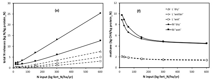
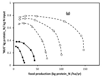
..though we can’t avoid this !! when plotting nitrogen use efficiency (as the y axis encompasses both food production and N input) : So we plot both variants below…
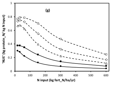
Policies, and lobbying for policy change, on the basis of ‘GHG intensities’ can only confound/cloud the issues of ‘efficiency’ and ‘absolute amounts’. For its international responsibilities in the scope of controlling global GHG emissions (and in likely national regulations) it is the amount per year of emissions per total NZ area, that is relevant. While of course it follows that for any given absolute amount (eg tonnes CO2 equiv. per NZ) of GHG emission, it would be better to produce more food (and so in that sense a more ‘efficient’ system is better). Likewise for a given level of food production per NZ, using a system with a better (lower) emissions intensity is better. However selling NZ, and setting a national GHG policy, on the grounds it is more efficient (uses systems with lower emissions intensity) is a deflection alone, IF the total area (or output) of that efficient system means the total absolute emission is great. For a simple practical example, as can be seen again above, dairy systems, even with high N inputs, have far lower ’emissions intensities’ than meat systems. But it cannot be denied, nor overlooked, that a doubling in the total area of dairy between c 2005 and 2015, nonetheless doubled absolute emissions.
Policy must be set on absolutes and not on ‘efficiencies’ (relativities), unless where the two go hand in hand beneficially.
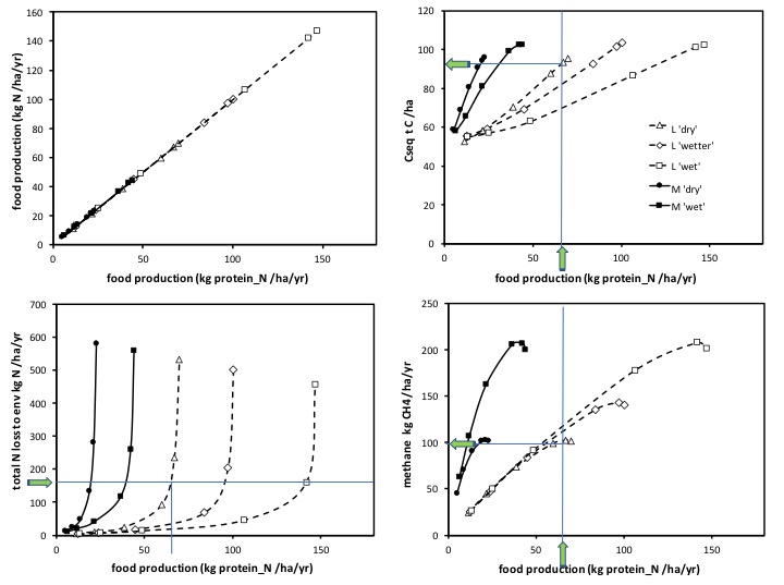
Seeking global optimal solutions – the best balance
[work in progress]
A basis for depicting more ‘global’ optimal solutions (ie taking account of the multiple outcomes required) is described in Parsons et al 2016. In the context of the graphs above it amounts to limiting N input rates to those at which C capture is first close to being saturated (the point where the system starts to become C limited). This approximates to c. 150 kgN/ha/year total N inputs. This input rate would have to be recognised as needing to be higher for ‘dairy’ compared to ‘meat’ animal systems (reflecting the greater need for N input to retain fertility when more N is removed .. in milk vs meat). Summer irrigation to avoid restrictions to C capture would equally be important. Using simple rules for sustainable nutrient management (and checks via soil N sampling to confirm the rules are appropriate/adequate) are already common and clearly would be effective, notably to sustain C capture following eg irrigation, and likewise to avoid excessive N inputs, made on the basis of a misunderstanding of how the system responded to changes in management.
This approach achieves the best compromise between the efficiency of N use, and the absolute rate of production of food. Note it does not represent the greatest N use efficiency. That is achieved in pastures where the system is highly N limited, and where the absolute rate of food production is therefore very small.
For systems based around ruminants, the harvesting of milk (dairy cows or sheep/goats) is substantially beneficial in the production of foodstuffs (and other products) compared to harvesting meat (and eg skins/wool).
Vegetarian diets (for humans) are recognised to have a life cycle footprint that is some 1.3 to 2.0 times lower GHG equivalents emissions than an equivalent ‘meat inclusive diet. It must be noted that a vegetarian diet in general still includes milk and often cheese.
This web page presents the biological basis for how best we understand the grazed grassland ecosystem (and its industry). The currency is mass of Carbon and Nitrogen. Converting the outcomes (inputs and losses) to monetary ($) equivalents would not be too difficult, but the conversions are subject to markets and even policy adjustments (prices and taxes altered to try to alter behaviour). So, that analysis is not attempted here, but in converse, all and any attempting to alter behaviour of farms, populace, and in markets, should at least ensure that the outcomes are desirable and valid in this biological context, and in ‘hard’ currencies (of C and N mass ..and CO2 equivalents).
The call (c 2017) for ‘fewer cows’ as a panacea is an example of a seemingly sensible, but evidently (here) potentially over-simplistic basis for attending to many of the components of the balance of land use and its impacts that we face. Sometimes ‘depth and detail’ has to be tolerated and taken into account even to get the most useful sociological solutions !