Here we compare the sustainable outcomes for different management systems in three parts:
i) Expected outcomes for NZ of intensification and possible de-intensification
ii) Comparing ‘meat’ and ‘dairy’ at 3 levels of N input – at a glance
iii) Comparing supplements and irrigation (all dairy at one N input) – at a glance
Expected outcomes for NZ of ‘intensification’, over last 20 years, and possible ‘de-intensification’
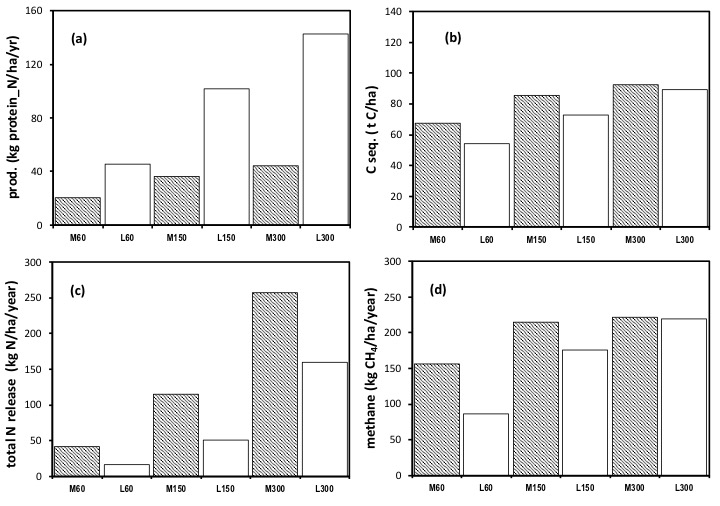
This series of histograms allows us to compare the long term, sustainable, outcomes of each of a series of management options that capture key aspects of the pattern of changes in grassland ‘intensification’ in New Zealand over the last 20 years, and some future options (notably ‘de-intensification’) that are being considered for the future. (For full explanation see Parsons et al 2016: ‘clarifications’). All values are expressed per hectare.
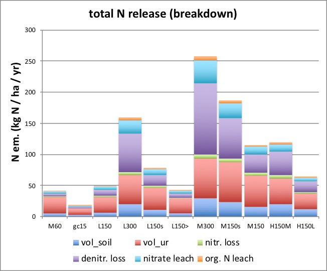
Outcomes are shown with respect to (a) production (units in milk or meat protein_N), (b) C sequestration, (c) total release/emissions of N to the environment and (d) methane emission.
Optimal utilization: the red bars depict meat based systems (‘M’) and blue bars, dairy based systems (‘L’), using an optimal grazing algorithm that best matches grazing ‘intensity’ (throughout the year) to the rate of supply of fresh forage, by maintaining an optimal mean vegetation state.
‘Relaxed, purposeful under-utilisation’: the green bars (colour chosen purely by chance note) show the different results obtained if ‘utilisation’ is relaxed, and so where the system is sustained at greater mean vegetation cover.
The numbers in the bar legend relate to the rates of input of N in kg N/ha/year.
The sequence compares: low input meat (‘M60’); grass-clover based dairy with biological nitrogen fixation plus atmospheric deposition of 15 kg N/ha/year (‘gc15’); dairy receiving 150 kg N/ha/year fertiliser N (‘L150’), then 300 kg N/ha/year (‘L300’); a dairy system receiving 150 kg N/ha/year fertiliser N plus supplements of 4 kg DM per animal per day at 2%N (‘L150s’); then a special case, where the rate of fertiliser N inputs has this time been reduced, when using supplements, so that the total N inputs are again 150 kg N/ha/year (‘L150>’). Next are shown high input meat (‘M300’), considering that farmers exiting dairy may aim to maximise production form a meat based system, and as a direct comparison between ‘dairy’ and ‘meat’; a meat system receiving 150 kg N/ha/year fertiliser and supplements per animal (equivalent to those for dairy) hence (‘M150s’), and a meat system with 150 kg N/ha/year fertiliser (‘M150’).
The two green bars compare meat and dairy at the same fertiliser N input, but with higher vegetation cover, see ‘relaxed under-utilisation’ defined above, hence (‘H150M’) and (‘H150L’). The ‘H’ denoted possible ‘H’ill country, as opposed to lowland, relevance (at the time of writing).
The four key ‘graphics’ are shown first, then each is shown enlarged (for ease of comparisons), followed by further histograms with detail of the breakdown of the components of N releases (for example). ‘Emissions intensity’ comparisons are also shown, and the Nitrogen Use Efficiency (NUE) for each case.
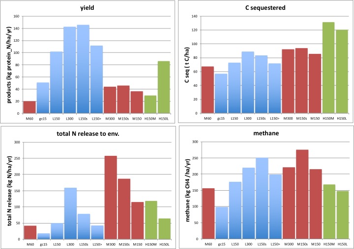
Multiple comparisons can be made, and see Parsons et al (2016). But one of the first, perhaps simplest, ways to start to view these graphs is to compare the different systems, systematically, eg if at the same rate of fertiliser N inputs. From this, it is clear (below) that a dairy system (‘L150’) has more than twice the yield of products (kg protein_N/ha/year) than a meat system at the same fertiliser N input rate (‘M150’). Sustaining the vegetation at a low intensity of utilisation (here a higher mean vegetation state, which also is associated with a lower stocking rate for the same level of inputs), reduces yield (green bars ‘H150M’ and ‘H150L’ are lower than the equivalent ones for optimal utilisation). Comparisons between systems at whatever is perceived as their current, often different, N fertiliser inputs are also possible, here, and with some other management options, further below.
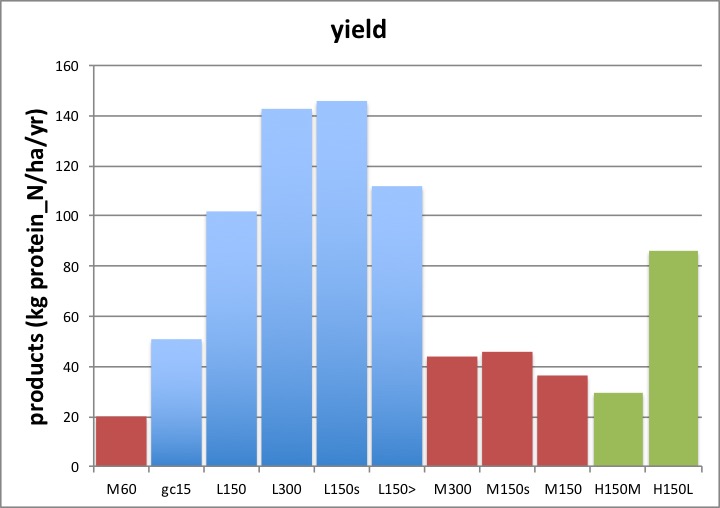
Note how supplements very substantially increase the yield of products (eg compare ‘L150s’ with ‘L150’), which in large part is associated with a major increase in the total input of N to the system (fertiliser plus the N in supplements led to inputs here of 223 kg N/ha/year) . Note (further below) how supplements correspondingly increase the total release of N from the system to the environment (graph ‘c’ , and below, drawn larger).
Note too: if the rate of N input as fertiliser is backed off, when supplements are used, so as to sustain the same total N input rate to the system, see ‘L150>’, yield is greater, even at this now same total N input rate, see ‘L150’. This yield advantage (and below the corresponding advantages for reduced N releases) is explained in Parsons et al (2016) ‘clarifications’.
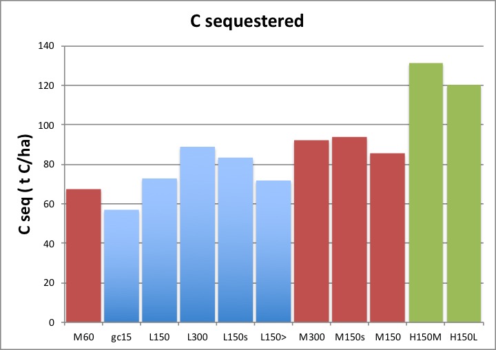
Among many other comparisons that can be made, it is clear, above, how sustaining a greater mean vegetation state (cf ‘cover’ or biomass), as in ‘H150M’ and ‘H150L’, can significantly increase C sequestration, albeit at the expense of a reduction in yield. Also ‘meat’ systems (‘M…’) lead to increases in the amount of carbon sequestered, albeit relatively small ones, when compared to ‘dairy’ (‘L…’) systems, at the same rate of N inputs.
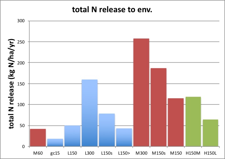
…but ‘meat’ systems give raise to far greater total releases of N to the environment, (when compared at the same N input rates) to ‘dairy’ systems. Note too how the dairy system receiving supplements, but where fertiliser N inputs have been backed off accordingly (‘L150>’), has lower total N releases to the environment than where no supplements were fed (‘L150’). This is due to the sustained higher C:N ratio of the supplement DM (here 2%N and c. 40%C, hence 20:1).
Basically, it is a far more effective way to use N to increase carbon capture (a higher rate of return in C for N is gained) to feed carbon in a supplement along with the supplement N (you get a sustained eg 20 units of C for each unit of N input this way), than it is to apply the same amount of N onto the soil surface, and rely on its uptake into plants, and the stimulation of photosynthesis (you get diminishing rates of return, as more N is added, such that the units of C captured, per unit of N added, falls toward zero). For further explanation of the dynamic effects of supplement N vs fertiliser N on the C and N cycles, see Parsons et al (2016) ‘clarifications’.
Sustaining larger mean vegetation biomass (cover), note, leads to slightly greater N releases to the environment, when compared at the same N input rates: less N is removed in products per ha and so more N sustainably must be released, once the N (like the C), sequestered in organic matter, has reached its new sustainable state.
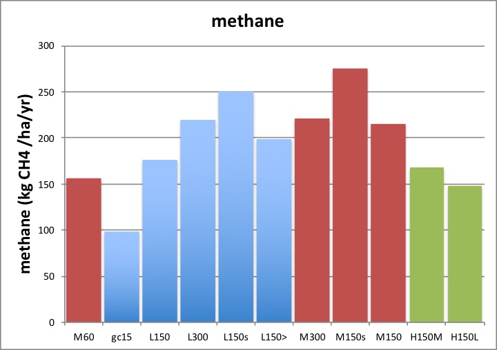
There are many subtle comparisons that can be made with respect to methane, but the key feature is how methane emissions per ha within a given animal class eg within ‘dairy’ or within ‘meat’ systems, reflect (for simple reasons) the rate of yield of products. But note how ‘meat’ systems lead to substantially greater methane emissions per unit product, as well as greater N releases per unit product (see two graphs below).
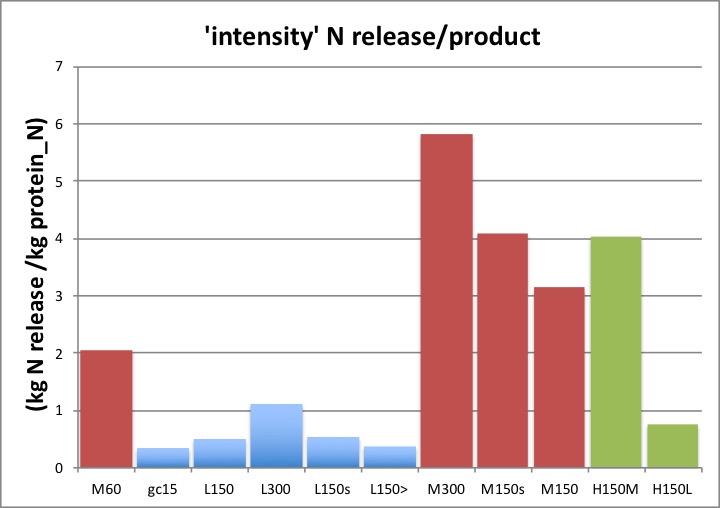
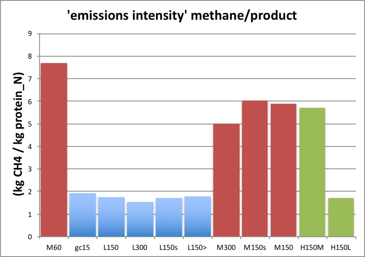
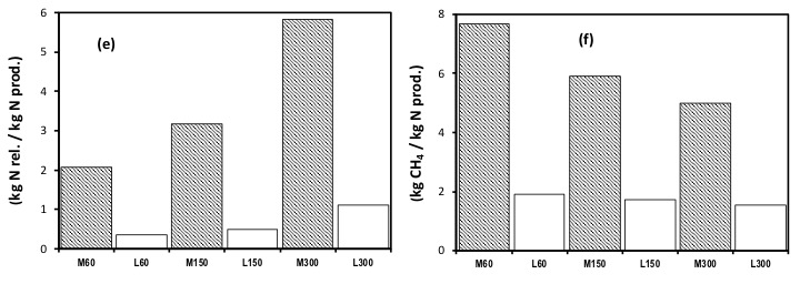
From the (two) graphs immediately above it is very clear that ‘meat’ based systems, and notably a purposefully under-utilised ‘meat’ based system substantially worsen the emissions of N or methane per unit of product, and this is a result of lower absolute yields of products per hectare, as well as in some cases greater absolute releases of N and methane, per hectare.
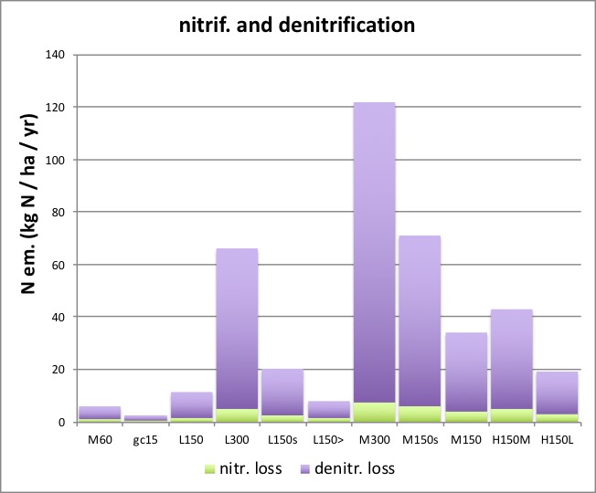
The graph above, and that below, show the breakdown of the total N losses in each case… It is very important to note these are the rates of release of N to the atmosphere or water, associated with those processes, and not the rate of those processes.
These emissions of N are in the form of both nitrous oxide and di-nitrogen, and where the balance between the gas forms being associated with, of course, oxygen availability (often expressed in terms of the inverse, high soil water content .. cf low oxygen availability). De-nitrification, alone, produces both gases and the proportioning between them is not understood to the level of precision required, given the potency of nitrous oxide as a GHG (tiny emissions of nitrous oxide (in kg) are significant when multiplied x 300, to derive the GWP). Hence here we constrain ourselves to accounting for the emissions of N. (Consistently and rigorously, units (kg) of elemental C and N are used throughout this entire C and N balance description).
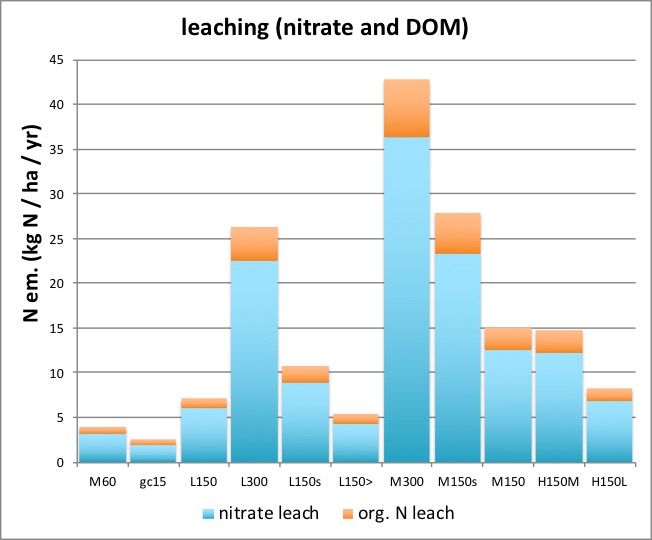
As widely recognised (and see Graphs ‘c’ in the sections on ‘fertiliser input‘), the release of N in leaching, like that in denitrification, increases ‘exponentially’ with increases in the rate of input of N into the system, though again, notice how the release is lower in a dairy system, than in a meat system, when compared at the same N input rate (reflecting how a greater proportion and amount, both, of N is being removed in products in the dairy system, and so is simply not sustainably available to contribute to sustained greater N releases). This does not deny that a meat based system, run at a lower N input rate, can have less N release impact than a dairy based system run at a much higher N input rate. What it does say however is that it is the N input rate (from fertiliser and/or supplements) that is the source and cause of that difference and not the class of animal ‘dairy’ v ‘meat’ per se. Indeed dairy systems have a far greater N use efficiency, and far lower (better) emissions intensity, than ‘meat’ based systems. All as shown above.
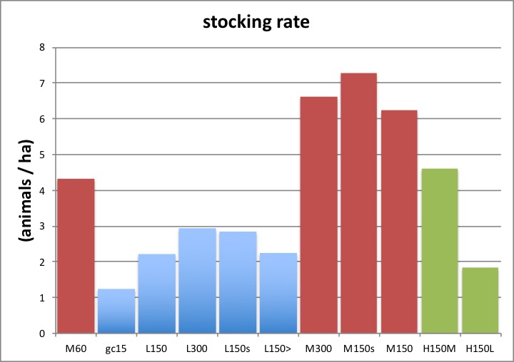
Finally, the figure below shows the stocking rates (recall this is an emergent property of the system, see under ‘stocking rate’) that each system sustained, bearing in mind also that more meat animals can be sustained per ha for any given set of conditions, than can dairy (lactating) animals, due to their substantial differences in their demand for intake per animal. This means in the graph below it is more relevant to compare stocking rates within each animal class. Note how the lower ‘utilisation’ (greater mean vegetation state, green bars) is synonymous with low stocking rates, than in the comparable (same N input etc) examples using ‘optimal utilisation’ management (wrt yield).
Comparing ‘meat’ and ‘dairy’ at 3 levels of N input – at a glance
The histograms below use some of the the exact same cases as in the examples above, and note also add a low input ‘dairy’ system (‘L60’), so that meat and dairy systems can be compared at a glance either at the same fertiliser N input rates, or for example comparing dairy at 150 kg N/ha/year fertiliser input with a meat system at eg a lower rate of N input (eg ‘L150’ v ‘M60’).
Comparing supplements and irrigation (all dairy, at one N input) – at a glance
This set of histograms uses the same data as in the first section above, for the first three bars. Recall this data is from simulations all based on met data (and soil type) from Ruakura (N Island, NZ) where there is a distinct seasonal pattern of growth, but not one characterised by a substantial dry period (insufficient water) every summer. All three examples are for dairy (‘L’). The first is with 150 kg N/ha/year fertiliser input (‘L150’); the second, the same fertiliser N input but with animals fed supplements at 4 kg DM per animal per day, at 2%N (‘L150s’), leading to a total N input (fertiliser plus supplement) of 223 kg N/ha/year; and the third the case described above where the same supplement policy is followed but where fertiliser N inputs have been backed off so that the total input of N returns to 150 kg N/ha/year, ‘L150>’.
For a more detailed analysis of the effects of supplements, see ‘supplements’.
The second three bars are based on the met data from Winchmore (S Island, NZ) where despite sustained water inputs from rain, there is insufficient water (a water deficit develops that limits photosynthesis) during three months each summer. Hence the unirrigated treatment ‘WL150’ is ‘dry’; ‘wetter’ is where some 50% more water has been added during each of the three critical summer months (so ‘WL150+’); and ‘wet’ is where sufficient water has been added in those months, to just relieve water deficit depressing photosynthesis (in practice some 100% more.. hence a doubling.. of rain water inputs), and so ‘WL150++’. All the three ‘irrigation’ examples are with 150 kg N/ha/year fertiliser N.
Hence, note the ‘wet’ well irrigated cases at Winchmore (eg ‘WL150++’) are close to the standard, natural rainfall cases (eg ‘L150’) at Ruakura, here and in all other graphs on this web site.
For a more detailed analysis of the effects of irrigation, see ‘irrigation’.
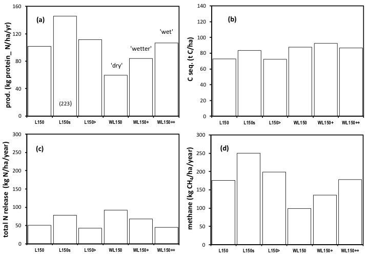
The comparison of the first three bars is laid out in the first section (coloured histograms) above. The bars are redrawn here so the effects of how supplement is used can be seen at a glance.
The second three bars reveal how the addition of water (during a critical period of water deficit) substantially increased yield (expressed here in kg protein_N) and this was by removing major constraints to photosynthesis. The amount of C sequestered at the Winchmore site was greater in general than at the Ruakura site, but C sequestration was not increased at Winchmore by irrigation at this fixed level of N inputs. This is a critical issue and is explained in detail in the section on ‘C sequestration’. In short, the addition of water, and the stimulation of yield, represents an increased removal of N in products, and without an increase in fertiliser N inputs, this leads to a sustained N deficiency in soils. Not one does the limit the potential for the increased photosynthesis to sustain greater sequestered organic matter, as in (b), but is evident in the lower total releases of N to the environment, as seen in (c). Irrigation, at a fixed N input rate, increased yield, had little effect of C sequestration, reduced releases/losses of N, and substantially increased methane emissions.
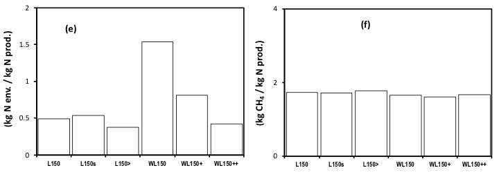
But, note that irrigation, here only at times of critical water deficiency in summer, is better seen perhaps as relieving a deficiency in C and N cycling… hence, a glance at the ’emission intensity’ N releases to the environment per unit product (e), shows the additional water serves to return the system to the values seen in unirrigated pastures in areas not subject to such water deficiency (values for last bar is close to first three).