
Supplements and how they interact with fertiliser N input and animal class
First as response graphs
Legend
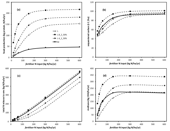
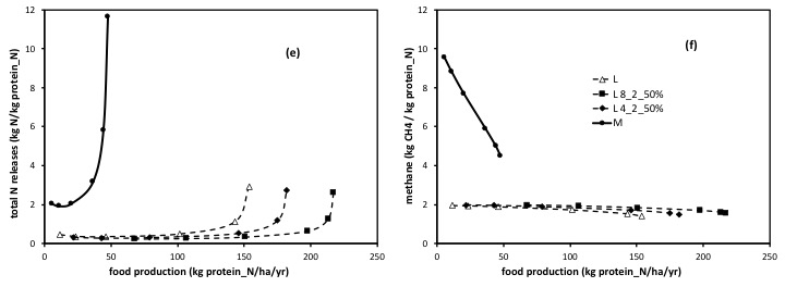
The response to nitrogen fertiliser N input (x axis) of food production (a); the total amount of C sequestered (b); the total rate of release of N to the environment (c) and the rate of emission of methane (d), all expressed per hectare. The solid line depicts ‘meat’ systems (cattle or sheep in general), and the dashed lines depict ‘dairy’ systems (which could equally be either cattle or sheep lactation based). The points (symbols) along each line are the solutions for each of a range of fertiliser N input rates (of 15, 30, 60, 150, 300, and 600 kgN/ha/year). For ‘dairy’, responses are shown for unsupplemented (open triangle, ‘L’) and for two levels of supplementation: either 4 kg DM per animal per day, with 2% N content, and a 50% substitution by animals for fresh forage (solid diamond); or 8 kg DM per animal per day, with 2% N content and a 50% substitution rate (solid squares). All outputs here are receiving adequate rainfall, and based on the met data and soil type for Ruakura, NZ. All are the long-term sustainable rates and states predicted by the model, noting that outcomes in the shorter term, including then those even from direct experiments/empirical measurements, can reflect temporary transients, some which run counter to what the final outcome will be after the whole system has re-adjusted (see ‘clarifications’). All are based on stocking rate being optimally matched to the rate of supply of fresh forage (see ‘clarifications’). This overcomes the scatter and distraction of simple ‘mis-management’ of pasture.
The first most striking differences seen in these figures are those between ‘meat’ and ‘dairy’ (effects of animal class cf physiological state) as explained under ‘dairy’ v ‘meat’. Hence the unsupplemented dairy (dashed lines with open triangles) and the unsupplemented ‘meat’ lines (soil lines with solid circles) here are identical to those shown on that page. ‘Dairy’ is characterised by a far greater removal of N in products (milk plus ‘retention’) (a), and a corresponding reduced rate of release of N to the environment, see (c), and this is a consequence of the substantially altered partitioning of N in lactating v dry animals. A greater proportion of the N eaten per animal (and so per ha) is partitioned to products, at the ‘expense’ of that partitioned to urine. All as described in that section and in [link to paper]. The resulting decrease in the amount of C sequestered, and in the emission per ha of methane, both reflect the resulting greater N-limitation to photosynthesis, when a greater removal of N in products (milk) is sustained, compared to the rate of removal of N in products in ‘meat’.
Against that background, the use of supplements has a major effect by increasing C and N inputs directly (as C and N in supplement), as well as by partially relieving N deficiency (notably at low to intermediate fertiliser N input rates) by increasing the amount of N cycling in the system. Adding supplements very substantially increased the yield of products (a); the associated added N input, in supplement, led to an increase in total N releases to the environment, though these (here) came only to match those seen in an unsupplmented ‘meat’ system (c). Relieving N limitation meant that at low fertiliser N inputs, greater C sequestration was achieved (b). Increased production (from greater animal intake per ha, more per animal and more animals) does however mean an increase in methane emissions (d).
The corresponding ’emissions intensity’ graphs are shown below. The effects of supplements on the rate of N releases per unit product, or methane emission per unit product, here, is very small (recall supplement examples are shown here only wrt ‘dairy’). The major difference between ‘dairy’ (lactating) and ‘meat’ systems is again evident.
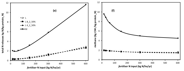
Likewise there is little effect of supplements in altering the nitrogen use efficiency (a small decrease in efficiency at intermediate N inputs) (g).
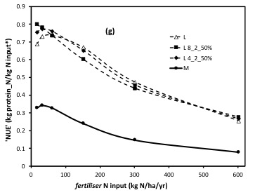
( *’N input’ on this axis, includes the N in supplement as well as the N in fertiliser.)
But supplements are a very effective way of adding extra C and N to the system:
What these relativities (emissions intensities and NUE) disguise is that supplement feeding gives us a major valuable insight into what limits our grassland systems. The system (like all plant based ecosystems) are ultimately C limited. As nutrient, notably eg N, input rates increase, photosynthesis increases initially near linearly, but then progressively with diminishing returns, hence plant DM production shifts from being N limited to C limited, as photosynthesis comes to respond no longer to higher N inputs and plant species reach their evolved ‘optimal/maximal’ N content, notably that in illuminated leaf tissues. So much is well recognised.
Hence in graph (a) above, without supplements added, the rate of yield of products plateaus, even as N inputs are increased (all as well recognised). Hence there is a limit to the capacity to increase C inputs to the system, using N as fertiliser, if the N is applied to the soil surface, relying on its uptake by plants and its being harvested by animals. By this route the number of extra C ‘units’ gained per extra unit of N input, falls to zero.
By contrast, when supplements are fed, and so C is supplied along with N in the supplement, not only can C inputs be increased (even after the system has reached a maximum photosynthesis per ha) but the number of C units gained per unit N input, does not fall, it remains at the level defined by the C:N ratio on the ‘bag’… (at 2%N in supplements, this approximates to a C:N ratio of 20:1). Hence supplements enable a sustained increase in C supply, to what is otherwise a C limited system. See ‘clarifications’.
Basically, it is a far more effective way to use N to increase carbon capture (a higher rate of return in C for N is gained) to feed carbon in a supplement, than it is to apply the same amount of N onto the soil surface, and rely on its uptake into plants to stimulate photosynthesis.
This benefit (to feeding supplements) becomes far more apparent when the input of fertiliser is ‘backed off’, when supplements are fed, and so the outcome of feeding supplements is compared at the same total rate of input of N. See section ‘systems comparison’
For graphs showing how the responses to N differs if one plots against total N input rate (fertiliser plus supplement N) on the x axis, and how this differs from that seen from fertiliser N alone (on the x axis), then see paper ‘clarifications’. This is far from being a moot point for understanding, as the papers cited explain.
Same information but plotted as a trade-off ‘map’
In the section ‘basis for policy’ we introduce the concept of plotting ‘maps’ which have an output from the model on both (the ‘x’ as well as the ‘y’) axes.
That section considers in detail how this enables us to weigh up options for altering the balance per se of production (whether concerned for food supply or income) in relation to environmental outcomes. It uses examples that consider fertiliser N inputs, animal class ‘meat’ or ‘dairy’, and irrigation.
Here we consider ‘supplements’ in the same context.
Legend :
The graphs below describe the exact same data as in the section immediately above, but where the bottom (x) axis is now the output ‘food production’ (whereas above it was fertiliser N input rate).
(Hence Figure ‘a’ is simply, and trivially, a 1:1 line ; but graph (a) is retained to preserve the same pattern of layout .. so one can ‘switch’ readily between ‘response’ graphs (eg with an x-axis of N input) and ‘outcomes/trade-off’ maps), to aid comprehension.
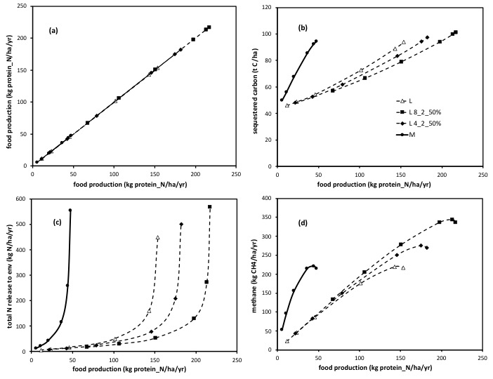
For a detailed account of how to read/interpret these graphs see the section ‘basis for policy’, and apply the same techniques to the graphs shown here.
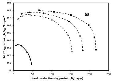
*N input on this axis includes the N in supplement as well as the N in fertiliser. The symbols along each line denote the fertiliser input rate alone, all as consistent with the response curve graphs plotted at the start of this section. In the (6) ‘maps’ immediately above, note all outputs both on the y axes, and now that also on the x axis, are from total N inputs (fertiliser N and supplement N).